
Data Visualization Literacy: A Need, A Language, and A Process

In this blog post from our series of blog posts about Open @ UTA Libraries, we talk about Data and more specifically Data Visualization. The need to understand data, analyze it, and then create meaningful insights is no longer an option but a necessity in this information day and age. And this stands true for the majority of the fields. However, there is still a misconception that Data Visualization and Data Analysis is reserved for Data Scientists and Computer Professionals. This blog is an effort to bring awareness to what Data Visualization is, why there is a need for it, and how to efficiently create your own visualizations.
Data
A word commonly used in the information age is "Data". Data is defined as “a collection of facts in a raw or unorganized form such as numbers or characters.” (What is Data, Information, Knowledge, Wisdom (DIKW) Pyramid?, 2023) Just as Research is not limited to a specific subject or domain, Data is now used everywhere. Today, you do not have to be a Computer Professional or a Data Scientist to use Data. For example, Physicians work with patient data, Pharmacists work with drug data, and Teachers work with student data. Your finances, your health pattern, your sleep cycle are all stored in the form of Data. In fact, Historians, Psychologists, Artists, Merchants, and Banks all work with data in some format. Depending on what kind of data you wish to store, your dataset may be Quantitative (numerical, fixed, and measurable), Qualitative (continuous), or Mixed (a combination of both).
And although for more discrete and specialized analyses of especially large datasets you will need to work with advanced research methodologies and an analysis software of some sort, you do not have to be an expert in research to be able to make and understand infographics and visualizations.
What is your data source and how was the data collected (and ultimately stored) are factors that can influence your visualization results. The more accurate, authentic, and complete your data is, the more authentic visualization you will be able to present. There are a lot of Open sites that can be used to collect open data. Read more about Open @ UTA.
Before you can begin to visualize, the data needs to be processed and analyzed. One of the most important steps in data visualization is to spend time with your data and “clean” it. This is usually done on Microsoft Excel or Google Sheets but can also be accomplished using Python or other tools. Cleaning the dataset includes things like removing duplicates and unwanted information. You may also have to change the headers, and the data type to suit your research question at hand. This is a rigorous process and requires documentation of each step. Proper documentation ensures that all the data processing conducted is recorded and can be traced back to get to the original raw data. It also sets a standardized procedure for the team and promotes transparency and fluidity.
Data Visualization: A visual - eye- zation of Data
(Good) Data Visualization is to aesthetically display complete and accurate data findings on a Chart or an Infographic in such a way that it is easy to read and understand. Minimalism is the key. A term often coined is the Data to Ink Ratio, which is the proportion of the ink used to represent actual data over the ink used to represent the remainder of the chart. The higher the ratio, the easier the chart is to understand.
Data to Ink Ratio = ink used for the data / ink used for the chart
When creating visualizations, keeping the design and the background color as neutral as possible helps the eye to focus on the important information. Minimizing the use of grid lines, shades, colors, and borders to only as necessary is beneficial in making the insights stand out.
When making a good visualization, choosing a good chart is crucial. The most common charts used are:
Bar Chart
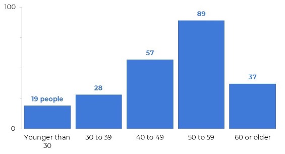
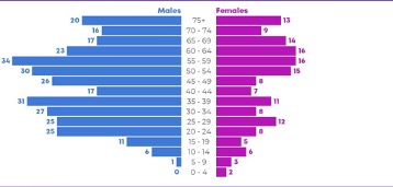
1) Vertical Bar chart: Best used to display comparison between data points.
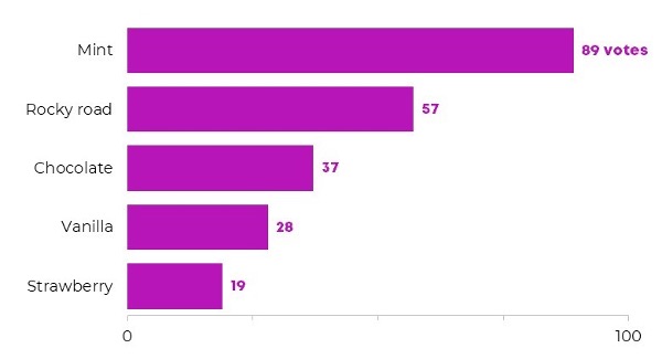
2) Horizontal Bar chart: Best used to display ranking and statistical data
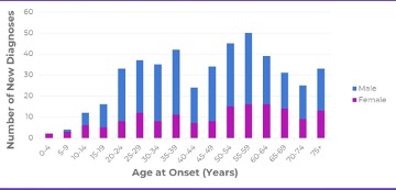
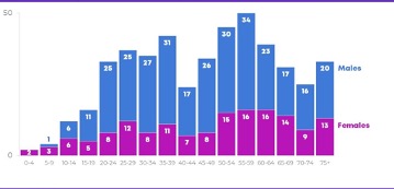
3) Stacked Bar chart: Best used to display proportional comparison.
Histogram
A Histogram is used to display the distribution of data over a continuous variable. A Histogram is used to understand the pattern of variables like time, population, and weight.
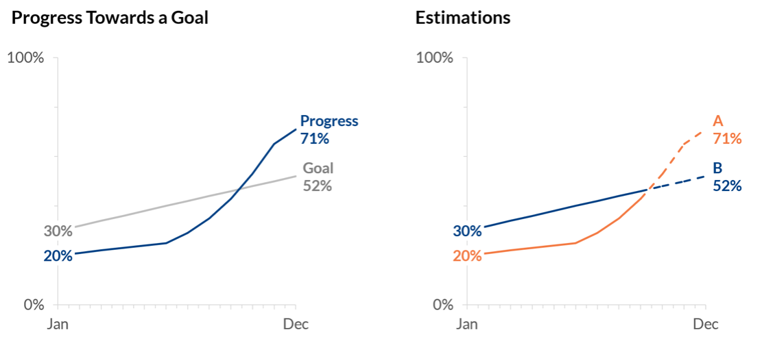
Line Chart
A line chart is used to display trends over time.
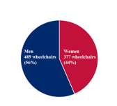
Pie Chart
When you have 5 or less items to compare in terms of the area and angle, a pie chart can be used. It is important to present only necessary information.
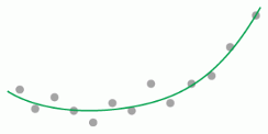
Scatter Plot
Collection of datapoints in the x and y axes, used to represent correlation, outliers, and clusters.
The Summary
Simple steps like maintaining the order of the datapoints, font, and formatting can make huge differences. When working with interactive charts, highlighting the relevant information by clicking on the part also helps improve focus.
When reading charts, it is important to notice the axes, labels, outliers, dates, and order of the data points. Focus on the font and look for signs of information manipulation.
Data Visualization Literacy (DVL) is not only the ability to make, read and understand visualizations effectively, but to detect any anomalies in the presented information. To be able to extract the information from a given visualization and interpret the findings is all part of DVL. Remember, not all charts are true and complete. To solely rely one’s reasoning on a dataset and a chart requires one to investigate the authenticity and validity of the information presented. DVL sets the standard for communication and understanding of insights and helps classify chart types according to the insight needs/research questions.
Familiarizing yourself with the visualization tools available for advanced visualizations such as Tableau, Power BI, Pandas, ArcGIS, RapidMiner, and NVivo will greatly improve your game in the realm of analysis and visualization. However, you can begin with something as simple as Microsoft Excel.
Where to go from here...
Data Visualization is a skill that is built over time with practice and continuous learning but by no means is it restricted to a computer professional. In fact, the UTA Libraries offer workshops and one-on-one consultations for your statistical and visualization needs.
If you would like to schedule a consultation or have data-related questions about your project, feel free to email datahelp@uta.edu to schedule a consult with our expert Data Librarians. Reach out to me for questions, direct consultations, and feedback at rubab.shahzad@uta.edu.
More to read on DVL...
Börner, K., Bueckle, A., & Ginda, M. (2019). Data Visualization Literacy: Definitions, conceptual frameworks, exercises, and assessments. Proceedings of the National Academy of Sciences, 116(6), 1857–1864. https://doi.org/10.1073/pnas.1807180116
References
Admin, W. (2018, September 10). Target Lines on Line Charts. Depict Data Studio. https://depictdatastudio.com/charts/target-lines-on-line-charts/
Better Evaluation. (2022). Scatterplot. https://www.betterevaluation.org/methods-approaches/methods/scatterplot
Börner, K., Bueckle, A., & Ginda, M. (2019). Data Visualization Literacy: Definitions, conceptual frameworks, exercises, and assessments. Proceedings of the National Academy of Sciences, 116(6), 1857–1864. https://doi.org/10.1073/pnas.1807180116
Emery, A. K. (2017, April 25). Pie Chart Makeover: Transforming a Research Report. Depict Data Studio. https://depictdatastudio.com/pie-chart-makeover-research-report/
Emery, A. K. (2018, November 13). How to visualize age/sex patterns with population pyramids in Microsoft Excel. Depict Data Studio. https://depictdatastudio.com/visualize-age-sex-patterns-with-population-pyramids/
Ontotext. (2022, April 8). What is the data, information, knowledge, wisdom (DIKW) pyramid? https://www.ontotext.com/knowledgehub/fundamentals/dikw-pyramid/#:~:text=The%20DIKW%20Pyramid%20represents%20the,and%20adds%20value%20to%20it.
Somers, R. (2020, October 30). Avoiding manipulation by Data Visualisation: A quick guide. Medium. https://medium.com/datasoc/avoiding-manipulation-by-data-visualisation-a-quick-guide-4c3673d15ba7
Add new comment