Websites
It’s important to convey a consistent identity for the University of Texas at Arlington Libraries in all websites and web pages. While keeping your web content aligned with our brand’s Personality and Voice as with all our communications, here are some additional guidelines to consider specifically for websites.
We are an “Official Unit” of UTA and therefore our websites are an official representation of the University. UTA has provided standards and guidelines with specific requirements for all such sites to:
- Include an approved UTA logo (included with UTA Libraries logo)
- Contain relevant contact information
- Include links to UTA legal notices and policies
- Contain a copyright notice
- Meet accessibility standards
- Follow UTA Information Security policies
Details and additional requirements can be found in Procedure IT-PR4 Web Standards.
An approved UTA Libraries logo must be:
- Included at or near the top of all web pages
- Presented in a visible, undistorted manner
- Used in one of the approved colors
- Linked to the UTA Libraries home page
Primary Colors
Blue #0064b1 rgb(0,100,177) cmyk(100,62,0,0) | Orange #f58025 rgb(245,128,37) cmyk(0,61,97,0) |
NOTE: For accessibility, do not use orange for text (or reversed text on orange), but for design elements and accents.
Secondary Colors
Dark Blue #003865 rgb(0,56,101) cmyk(100,60,10,53) | Dark Orange #e04e39 rgb(224,78,57) cmyk(1,83,85,0) | Grey #c4bcb7 rgb(96,188,183) cmyk(5,8,10,16) | Light Blue #bdd6e6 rgb(189,214,230) cmyk(27,4,1,1) |
For additional secondary colors, see UTA Brand Guidelines.
Typography
| Heading One <h1> | Open Sans – Regular, 32px, UTA blue (automatically applied to page titles) |
| Heading Two <h2> | Open Sans – Regular, 24px, UTA blue |
| Heading Three <h3> | Open Sans – Regular, 22px, Black |
|
Body Text |
Montserrat – Light, 16px, Black |
Page Layout
Content pages use headings, subheadings, bulleted lists, and accordion content to keep information well organized and easy to scan and navigate. Content can also be added in responsive columns, which will automatically stack on top of each other for smaller screens.
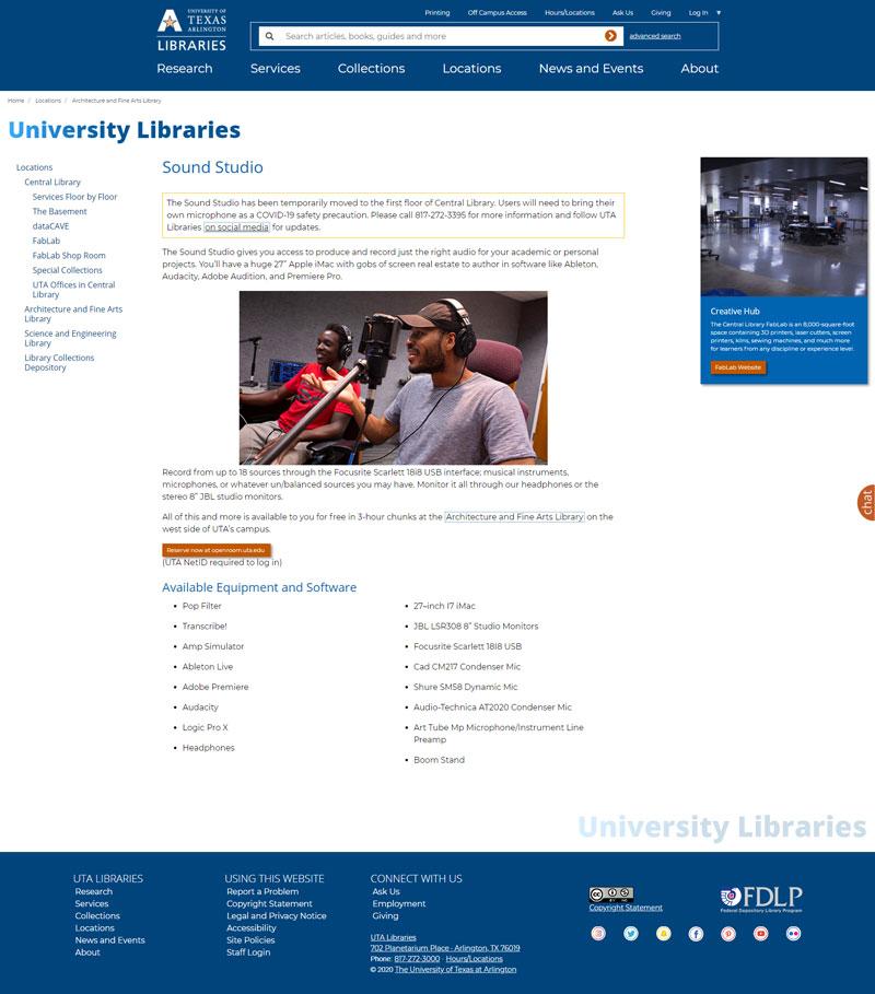
To show our personality, facilities, and resources, images should be used within pages whenever possible. At least one right sidebar with image should be included in every page (maximum 2). The sidebars should contain content that is relevant or related to the page content.

When redesigning the Libraries’ main website, we found it useful to identify several personas based on the diverse demographics of our website visitors. Their goals, concerns, typical tasks performed, and user environment guided our decisions on content, graphic design, organization, and navigation.
| Gabrielle Flores | Undergraduate Student | Full time student, full time class load | On campus student |
|---|---|---|---|
| Erica Vickers | Graduate Student | Works full time, part time class load | Online student |
| Chirag Patel | Graduate Student | Full time student, working on campus part time, full time class load | On campus student |
| Professor Rhonda Henry | Assistant Professor | Full time professor with full time class load | Teaching on campus |
| Frank Holden | Visitor/Researcher | Museum employee | |
| Mrs. Edelman | Visitor/K-12 Teacher | Elementary teacher |
In order for our website to have the most up-to-date information, we have enlisted staff across the Libraries to be our content editors. This means the people in-the-know are updating services and resources that are available in a timely manner.
Each content editor goes through training on how to edit the website, keep the content accessible, and maintain a consistent look and voice. Staff can request content editor training by emailing librarynews@uta.edu.