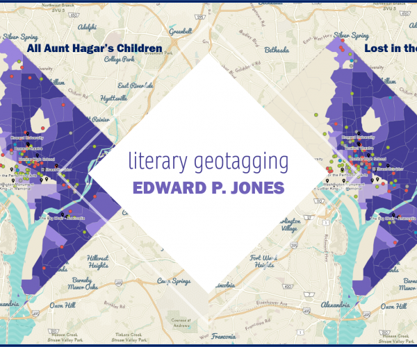
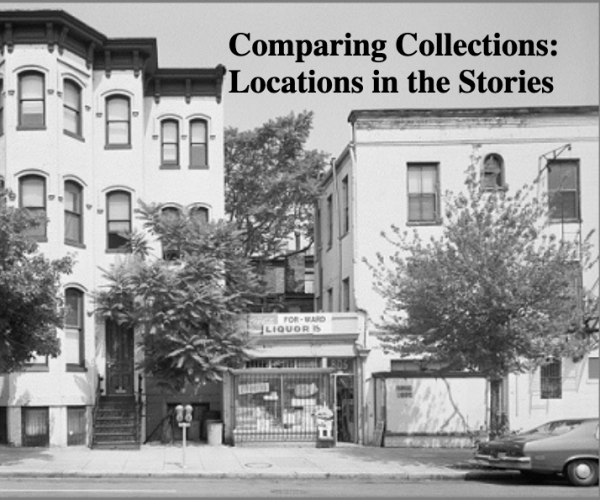
#vizoftheweek 15: Literary Geotagging - Edward P. Jones and Spatial Storytelling, Part II
For the final #vizoftheweek, read the second of 2 posts about how locations in Washington, D.C. were analyzed in stories by Edward P. Jones.
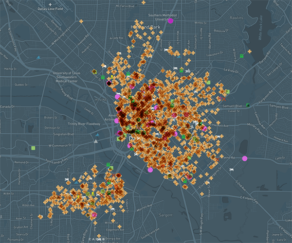
#vizoftheweek 14: Dallas Death Map
Have you ever wondered which parts of the Dallas area are “haunted”? An interactive map created at UTA Libraries lets you do just that.
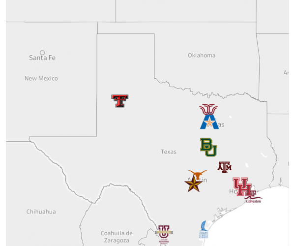
#vizoftheweek 13: Mavs Dataverse
UTA Mavs Dataverse is a member of the Texas Data Repository (TDR), a consortium of nine Texas academic libraries. Mavs Dataverse serves as an open…
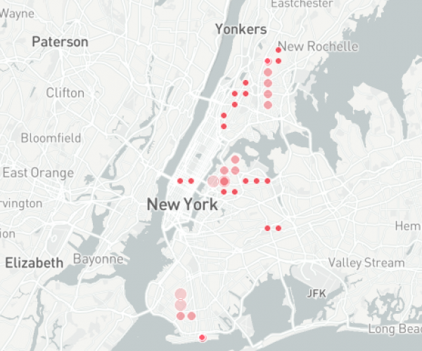
#vizoftheweek 12: Subway Growth and Transit Deserts in NYC
While New York City’s subway system is famous, New Yorkers living in the outer boroughs of the city also face the reality of transit deserts.
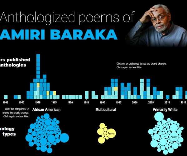
#vizoftheweek 11: Amiri Baraka, Poetry and Anthology Data
Why build a dataset on Amiri Baraka? Dr. Howard Rambsy explains the process of studying literary history using digital tools.
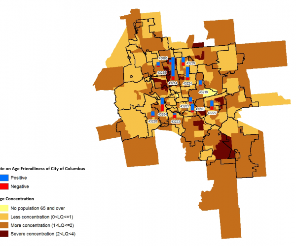
#vizfotheweek 10: Age Friendliness in a community’s characteristics
This blog post is about use of GIS in research. The study identified the relationships between socio-economic demographic characteristics of…
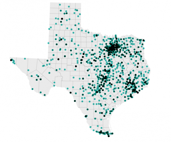
Mapping with Datawrapper: Texas UFO Sightings Map
This week, I decided to learn a new data visualization tool: Datawrapper. What better dataset to try it out with than the UFO sightings dataset I’…
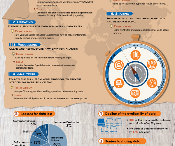
#vizoftheweek 9: Managing Your Data
View the steps necessary to manage your data successfully throughout the research data life cycle.
#vizoftheweek 7: Literary Geotagging - Edward P. Jones and Spatial Storytelling, Part I
This week, read the first of 2 posts about how locations in Washington, D.C. were analyzed in stories by Edward P. Jones.
#vizoftheweek 6: Labor and Digital Humanities
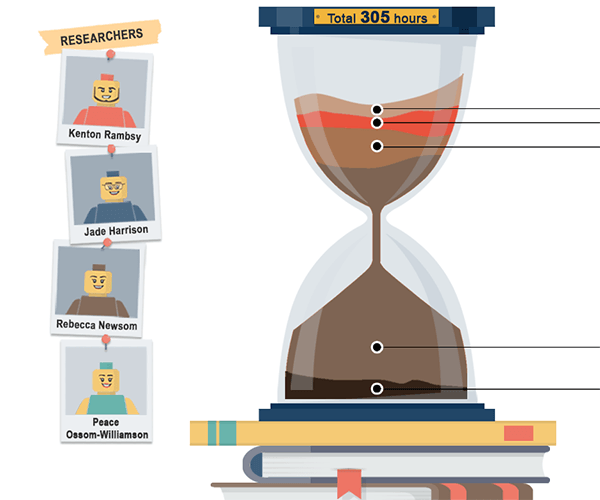
Have you ever seen a digital humanities project that interested you, but you didn’t know what it took to create it? This #vizoftheweek breaks down…
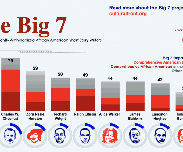
#vizoftheweek 5: Quantifying the Circulation History of African American Short-Story Authors
Standard literary histories, which emphasize key dates and moments, sometimes minimize subtle but important developing patterns, which take shape…
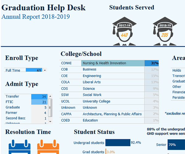
#vizoftheweek 4: UTA Has a Team That Will Help You Graduate
The Graduation Help Desk provides services to all undergraduate students and can help you overcome barriers to graduating on time, including any…